Review: The Banner Saga, by Stoic
by

Stuart Holland
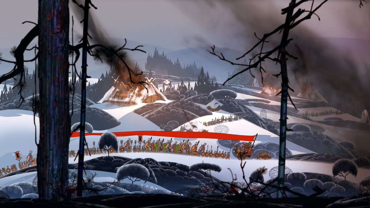
Next up on #BackCatalog is The Banner Saga, which is a beautiful strategy RPG
I started it a long while back on Game Pass but didn’t get too far (it is not a long game). Unfortunately it has fallen off Game Pass, so I bought it to continue now 😅
I was at 14/39 achievements and I can do better than that!
There’s a great merger between random events and an authored story - if I hadn’t dug into the mechanics of the “journey” online, I would’ve assumed it was all authored, not generated
It does story choices very well - several choices are very difficult to make and often it’s not clear what they’ll lead to (appropriately so for the story, though I suppose some could find that frustrating).
Some choices have far-reaching consequences and I get the impression that the story branches quite a lot, from what I’ve read around the other choices
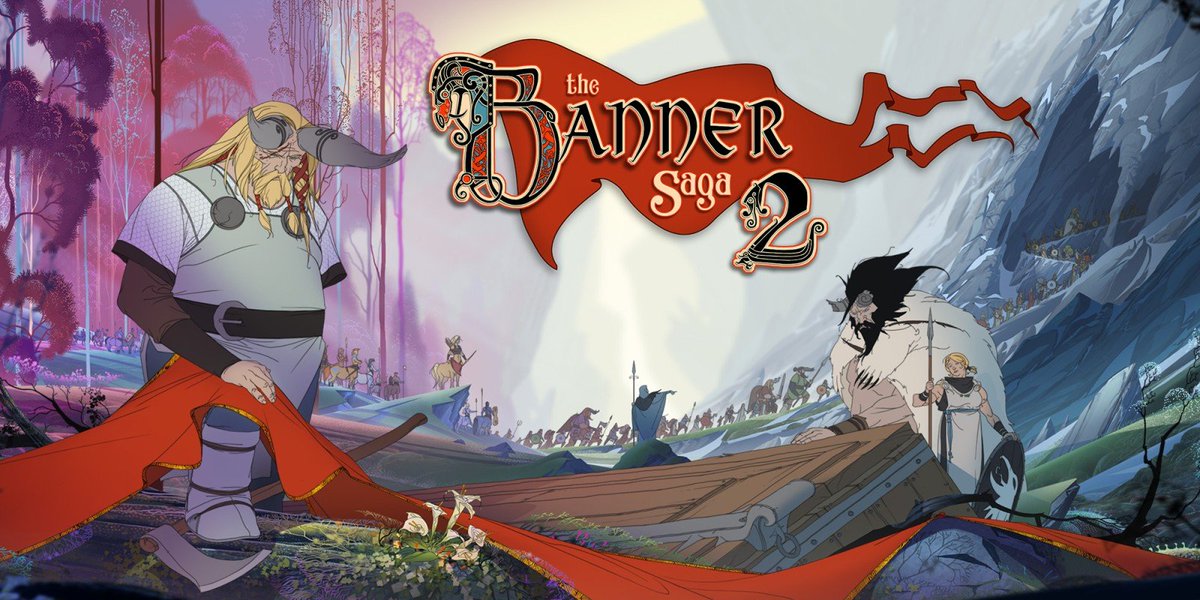
The Banner Saga is also the first of 3 and I believe your progress/choices carry over into the next titles, Mass Effect style
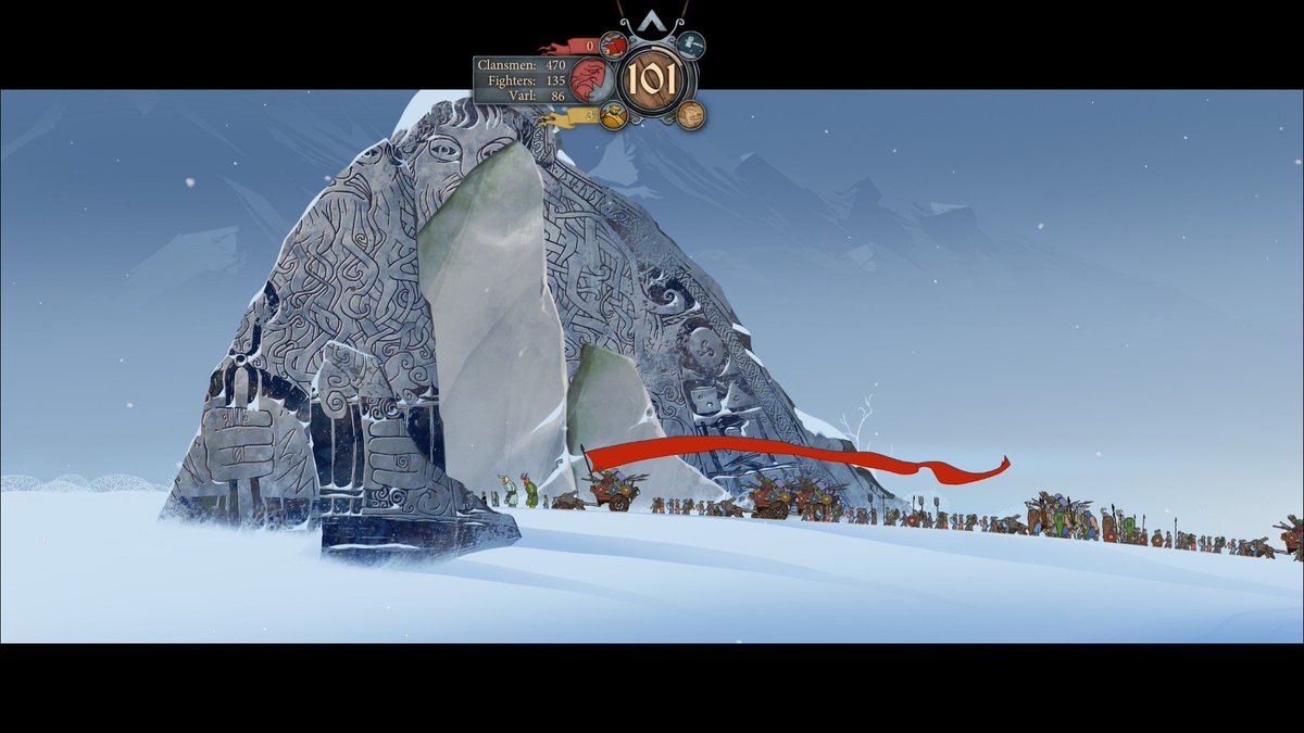
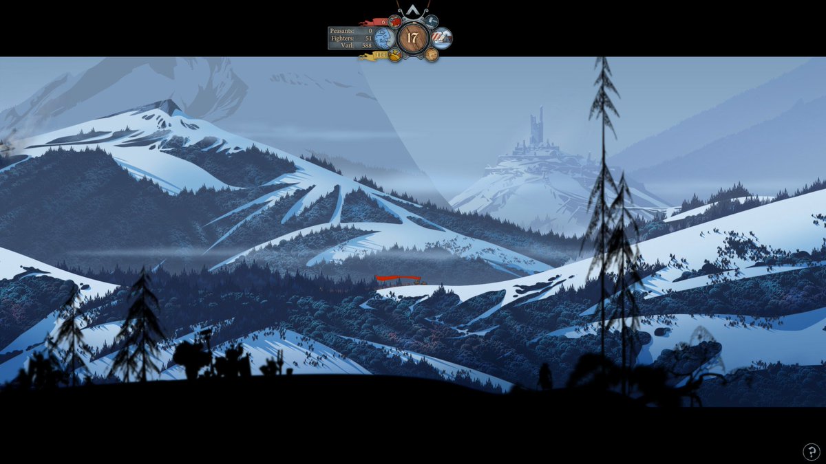
It has a very novel combat system, with the way its action economy works and the balance between armor/health (and the linking health to damage output). Even the turn order is quite unusual and gives you another thing to strategize about
And did I mention it’s beautiful?
However. All of my #BackCatalog reviews are generally quite positive (and this one is too) and that’s intentional. But with The Banner Saga, I have gripes. Because it is beautiful and deep and awesome and infuriating. It is a UX nightmare
It is frequently extremely unclear which item is selected when a menu is on screen. And even worse, pressing the stick in a direction often highlights UI elements that aren’t quite the ones you’d expect in that direction
Combine that with the fact that it’s hard to even know what the actual selectable elements are, it leads to a very frustrating menu navigation experience
Combat is also a UX nightmare. UI elements frequently overlap and hide vital information (like how much health your enemy has).
Continuing the “what have I selected?” experience, it is often very unclear which enemy you are about to attack with a given action, which is never a good thing in a strategy game.
Also, moving your unit commits you to to that square that turn, but you can only see the projection of your attack range from the space after you’ve moved, so I often moved and then realized I couldn’t actually attack
That means the most effective way to move is to count out squares manually before ever moving, but I have better things to do with my life, the computer can do that for me, thanks.
To add to the “not knowing who I’m going to attack” - the buttons required to initiate special attacks and manage their targets are not the same as standard attacks. So if you use the selection method for normal attacks on specials, it doesn’t work (and vice versa)
The text that describes abilities is frustratingly inconsistent:
“Hits all units between this unit and the target space” - Great, I’ll avoid hitting my allies with this
“Hits all adjacent enemies” - NOPE, this hits your allies too (and they’re dead now)
Stack on top of all of that that the combat system is great and very unique. But it seems to specifically punish exactly the kinds of mistakes those UX issues encourage you to make (individual ineffective turns have ripples into your entire strategy)
So, that has been a gripe-fest, but I honestly say all these things because I loved The Banner Saga and would still wholeheartedly recommend it. Maybe the UX is better on PC, I certainly got the impression some menus were for a mouse/keyboard
To end on a positive note, The Banner Saga makes you care about all of its characters and presents difficult, meaningful, and human choices. Its artwork is amazing and I’ll be playing the second game in the future!
The Banner Saga